
03-18-2012, 01:11 PM
|
|
Club Cobra Member

|
|
|
Join Date: Mar 2002
Location: arroyo grande, ca,
ca
Cobra Make, Engine: NAF 427
Posts: 1,775
|
|

 Not Ranked
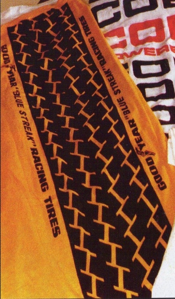
Good suggestions guys and glad to go in that direction. I've asked Buzz for the fuzzy tread image and we could all keep our eyes open for a good Cobra logo.
I'll image a pic of the original Brock tee shirt out of the SAAC annual. The tread pattern apppears to go straight up and down but slanted image would probably look more "artistic".
Greg
|


 Hybrid Mode


